The Bloomberg Startup Barometer

I came across this index from Bloomberg that tracks the health of the US startup ecosystem.
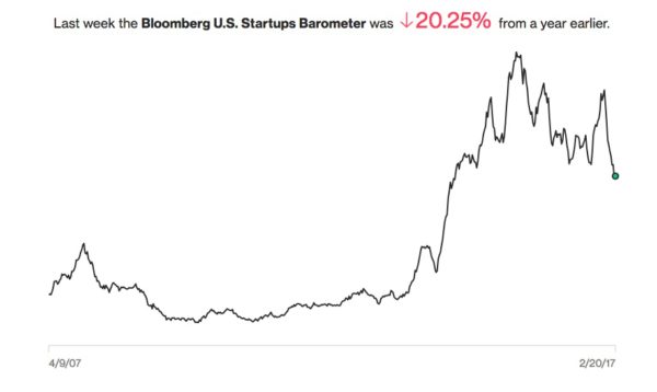
This index “incorporates both the money flowing into VC-backed startups, as well as the exits that are making money for investors. To smooth out some of the volatility, we calculated the average value for the last 12 weeks.”
I like that they are tracking both inflows (investments) and outflows (exits). What’s interesting is that over the past year, the exit chart is looking better than the investment chart:
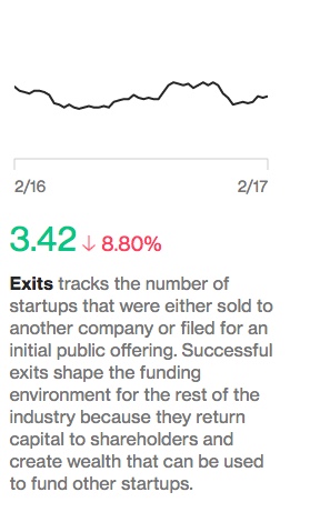
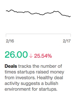
If exits continue to outpace investments, that’s a very bullish thing for the startup sector, particularly for investors. But what is good for investors is ultimately good for founders because strong performance will lead to more capital flowing into the sector.
This chart is investments since 2007:
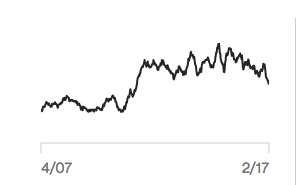
You can see that the VC sector ramped its investing activity significantly in 2010 & 2011 and has maintained it at roughly those levels (with some tailoff recently) since then.
This chart is exits since 2007:
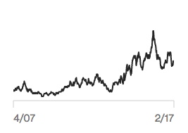
You can see that exits did not start increasing until 2014, roughly three to four years after the significant pickup in investment pace. That makes sense because of the “gestation period” of startups is at least four years and in most cases longer.
I will be keeping my eye on this new index from time to time. And I will be most interested in the shape of the exit chart because it is the strongest predictor of the long term health of the startup ecosystem.


.jpg)


