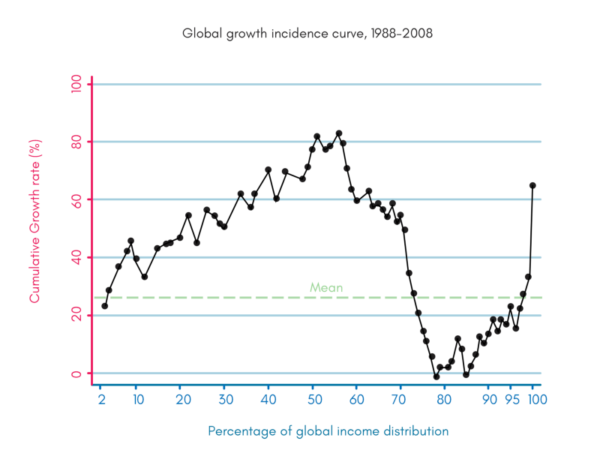
Elephant Chart

I came across this chart today. Maybe all of you have seen it, but I hadn’t.

It is called “the elephant chart” because the shape of the chart looks like an elephant.
It was created by Christoph Lakner and Bruno Milanovic for their book, Global Inequality: A New Approach for the Age of Globalization.
It charts the change in income by the absolute value of income on a global basis. So we see how someone in Africa living on a dollar a day compares to someone living in the developed world at $100 a day.
Bruno Milanovic discusses this chart in this blog post. It is short and well worth reading for some context.
For me, the story this chart tells is the movement of low cost labor from the developed world to the developing world over the past 25 years. This movement has allowed the “global middle class” to raise their incomes 60-80% while the middle class in the developed world has been stalled out.
But globalization doesn’t stop, nor does automation. And what one would expect over the next 25 years is the global “middle class” will similarly stall out and we will see increases at the far left (the 0-30% range).
The small group of people that are immune to this trend are those that make their money on capital, not labor. They are on the far right of this chart and they have done very well over the last 25 years and, if this story continues to play out as it has, should continue to do so.
There’s a question of whether this is a good thing or a bad thing. The least developed parts of the world are developing rapidly. And very few people are experiencing absolute declines in income.
But whether or not this is a good thing at the global level, this redistribution of income growth creates political issues locally and we are certainly seeing them play out this year. And I would expect these issues will become more pronounced in the coming years.


.jpg)


.jpg)
