The Financial Times team shared this visualization of how COVID has gradually become less lethal over the pandemic in the UK.
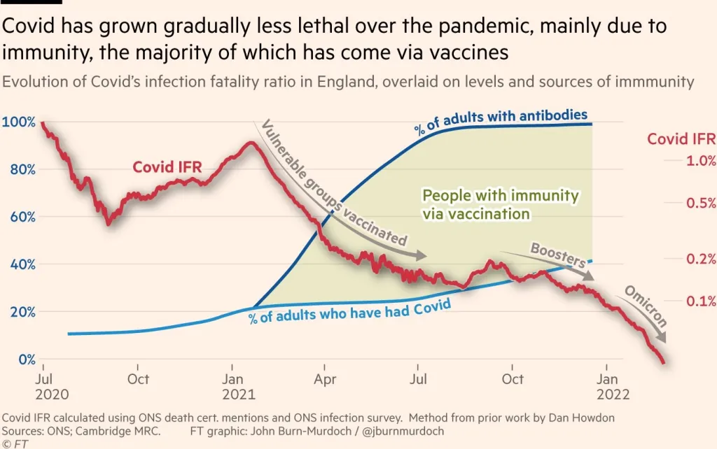
The TLDR: Thanks to immunity driven by vaccines and those who have had COVID, the Omicron wave is trending toward* being just as infectious as the flu in the UK.
There are so many layers of data in this one exquisite graph. A powerful reminder of the impact of thoughtful data visualization.
H/T: Dan Cullum for sharing this on his excellent daily blog.
*PS: I’m hopeful that trend will continue for the new BA2 variant as well.

Vachana literature has made a significant contribution to the enrichment of Kannada literature....
Read More
Environmental Awareness Initiative Conducted by Dharmasthala Sanghadi...
Read More
Yoga Day celebrated in various places in the district...
Read More
LKG Class Inaugurated at Gaddehalla Government School...
Read More